Finally!! Diva Challenge #245: Hollibaugh

Hurray, I finally made it! After following many challenges over the past few years, and especially the Diva Challenge, I finally got to play and even in time before the next challenge! I’m really happy right now. 😀

This week’s Diva Challenge was all about Hollibaugh. Hollibaugh is actually one of my favourite tangles because 1. it is very simple and yet has a beautiful, dimensional effect 2. it is a brilliant connector of several tangles some distance away 3. it can be varied in SO many ways (you can replace the white “bars” from Hollibaugh with any other borderish tangle, or even Tipple or any other tangle with an aura (or without) a myriad of other things. When Laura wrote that it is the perfect tangle for beginners, I thought then this challenge must be the perfect challenge to start playing! Here’s my tile for challenge #245:

Diva Challenge #245

Tangles used: Hollibaugh (obviously 😀 ), Meer, Printemps, Reticulated, Tipple and 2 unknown tangles (border on the right and bottom PLEASE help if you know the missing names and leave a comment!)

It seems I never can stay within my border, no matter how strong I draw it. As if the border was just a warning “Attention! The tile ends in 4mm (or less)!” ^^;  But I guess that this is part of my “style”? Well, decide for yourself. I’m very happy with this one, especially with the happy accidents I think nobody will notice anymore.

I’m not sure that I can play regularly from now on, but at least this is a first step!

Finally some progress: One Zentangle a Day – Day #3

Oh my, it has been ages again since I posted something here… Especially if you are looking for anything on my “One Zentangle a Day”-project. But after a very busy Inktober and after I finished compiling and crafting an art supply Advent calendar for a fellow ATC artist on a German ATC website (I’ll show you some pictures of that after 1st December!), I FINALLY found the time again to continue this project!

Since it hast been such a long time I last posted something on this project, here’s a short reminder of the rules (let’s just forget about rule number 1 for now.. :-D):

  1. I definitely will NOT be able to tangle or post a tile every day, but I’ll try to squeeze in two tiles per week. If it is just one, that’s fine, too, as long as I make progress.
  2. I’ll only use the tangles introduced in the book up to that point for a tile. To be able to stick to this rule, I’ll keep a list (not on the blog) I can refer to without having to flick through the book all the time.
  3. No day shall be skipped (even though I already know that the “white on black”-challenge will be very hard for me..) and no excuses are allowed here.

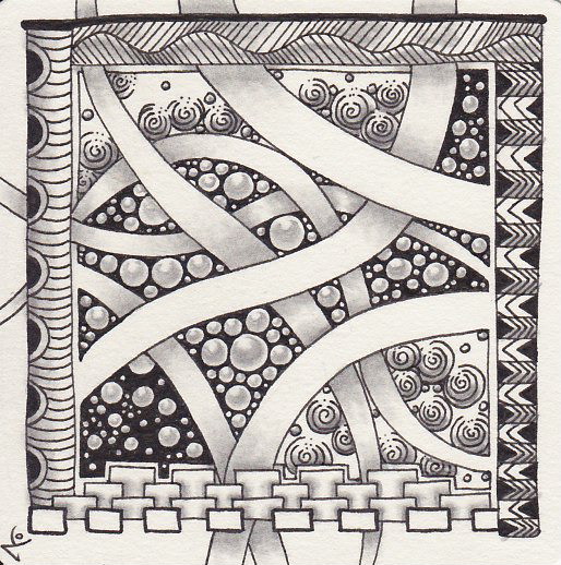
I was stuck on day number 3 already.. New tangles for today were Pokeroot, Festune and Hollibaugh Here is the first tile I did:

One Zentangle a Day - Day #3 (fail)
Tangles used: Fescu, Festune, Hollibaugh, Pokeroot, Tipple

The problem was that my tile had way too little value. I spent almost as much time shading the tile as I spent tangling and the result is pretty… boring. There are no especially dark or bright areas which attract the eye, it is just one big mass of (nearly the same tonal) grey.. And the effekt of combining Hollibaugh and Pokeroot to create an interesting effect is completely non-existent. I tried to further darken areas with my pencil, but smudging it also lightened it up again, so I didn’t really get what I wanted. This tile was a huge diappointment to be honest, but it taught me a very valuable lesson about tonal values. That’s why I thought I’d still post it here so you can see and maybe learn from it, too. 🙂

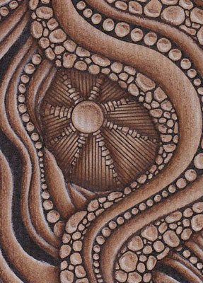
The tile above ist actually from some time in October. Yesterday I sat down while I was waiting for my very own Advent calender to arrive (no luck there, unfortunately) and tangled a new tile to see if I could do better. I do like the second tile a lot better, although Pokeroot too small AGAIN. I just can’t help it and I guess we will never be friends.. Anyway, here it is:

One Zentangle a Day - Day #3
Tangles used: Crescent Moon, Festune, Hollibaugh, Knightsbridge, Pokeroot, Tipple

I really like the tangle connections here, especially how Hollibaugh keeps the whole thing together! Crescent Moon now looks like a tunnel Hollibaugh is crawling through. Overall I think that the effect is even stronger on the screen than on the tile, which is nice for a change. ^^ It is only Pokeroot that I’d really love to eradicate from this piece.. But of course I can’t and I wouldn’t do it because that’s Zentangle and because it is another good lesson for me to learn.

See you soon for the next days and lessons to be learnt!

Tangling on brown paper

Hello everybody,

I didn’t forget about you! It’s just that I’m busy with a fun project right now which (again..) keeps me from tangling. I’ll definitely post a few pictures of the project here – however, you have to be a little patient. I’m building an Advent calendar with art supplies right now for an Advent calender swap hosted on the German ATC website http://www.kakao-karten.de and of course I can’t post anything right now because I’d be giving away who the person I’ve been shopping secretly for is. But I’ll definitely post a picture or two here, it’s such fun to make such a calendar for somebody! 🙂

Although the calendar has taken up a lot of my free time (and will still need my attention after the end of next week when the calendar should be sent to the recipient), I still took the time to tangle a bit. Still no other challenges or the continuation of my “One Zentangle a Day”-project, but something I’d like to share with you, tangled ATCs (Artist Trading Cards for all those who don’t know them) on brown paper.

116_At the Heart of Things_überarb
At the Heart of Things
Tangles used: Arukas, River, Riverstones

117_Growing
Growing
Tangles used: Beadlines, Diva Dance, Flez, Pokeleaf, Tipple

It was such fun to tangle on brown paper! I used the “standard” black Sakura Microns for the tangles and for shading a Faber-Castell Polychromo in Burnt Umber. The highlights were drawn with a Polychromo in Warm Grey !. The two pictures’ tonal value looks a little different, but that’s only because the brown paper is unfortunately quite hard to scan… and I’m lousy at finetuning the pictures. But I guess that’s okay. I’m still afraid to say that the truth lies somewhere between both pictures.

I’ll definitely tangle more ATCs on brown paper!  (Maybe that will help with getting the finetuning right someday, too XD)

Inktober 2015 – An Overview

Inktober was such fun! I really like drawing on a daily basis (for as long as I had the time) and simply loved to follow on Twitter what everyone else did for this wonderful challenge. Unfortunately, I only made it to day 17 of Inktober, I simply couldn’t keep it up any longer. However, this is a lot more than I thought I could do, so I’m still happy and I definitely want to try again next year!

Here I have the overview on all the Bijou tiles with all the Zentangle-inspired drawings I did last month. Although it is strictly speaking only halfway done it’s still a great thing to look at! Which one is your favourite?

Inktober 2015_Übersicht_klein

I have so many favourites that it would be faster to tell you which ones I didn’t like. But I won’t do that. Inktober is not about critizising but about developing good habits and maybe even seeing some progress in your work. And I’m really satisfied with this last point!